
When Technology Makes Life Harder: Why Product Teams Trade Simplicity for Control and Data

TL;DR: Product complexity is not accidental; it’s a strategic choice. Teams consistently fail by making simple tasks harder (like turning on the air con) because they suffer from User Focus Drift, prioritising the illusion of innovation and chasing abstract features instead of solving the core user’s problem. Companies deliberately remove useful features (like physical controls or ports) to gain control, cut costs, and force users into paying for subscription services and sharing data. The solution for product leaders is simple: stop designing for internal profit and control, and make simplicity the actual promise to the customer.
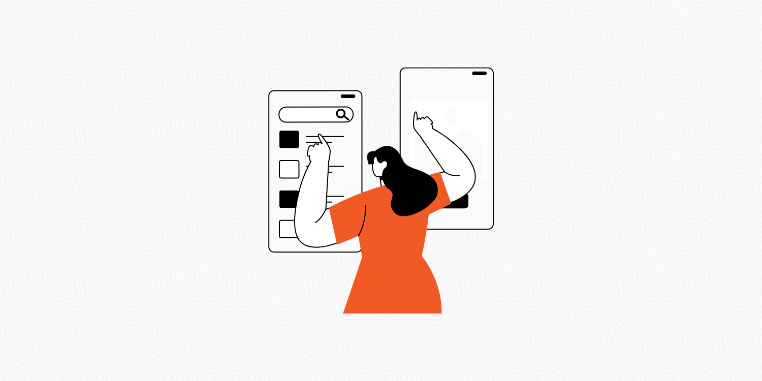
If this kind of product strategy breakdown is useful, the newsletter is where I keep pulling apart the decisions behind the frustrations. Subscribe if you'd rather understand why it keeps happening than just be annoyed by it. Thank you :)
You know that feeling when you’re in a new rental car late at night? It’s boiling hot inside, and all you want to do is turn on the air con. Back in the day, that was easy. Just reach down and turn a physical dial. Done.
But now, in a “smart” product, everything is on a touchscreen. You’re trying to navigate this digital maze, tapping through menu after menu, while keeping one eye on the road. What should be a simple button is buried deep in the settings. By the time you find it, you’ve missed your turn and you’re still sweating (I’ve done this. It’s not a hypothetical).
This is a product failing at its most basic job. We’re told we’re getting innovation, but a lot of the time the solution just makes it harder for the user. The products are “smarter” but the experience ends up being way more frustrating than the low-tech alternative.
Cars that Over-Engineer the Core Job
Car dashboards provide a perfect case study in product prioritisation failure. Old physical controls, the volume knob, the climate dial, made sense because they offered functional clarity: their function was quick, obvious, tactile, and reliable. You could adjust the air con or change the volume without shifting focus and sight from the primary Job-to-be-Done (JTBD), which is obviously, driving the car.
Now, essential controls are digitised. Want to open the glove box or adjust your mirrors? That requires menu hunting and tapping through software layers. This is not progress; it is adding unnecessary friction and complexity under the guise of innovation. The product team has prioritised the platform’s ability to host software over the user’s safety and efficiency. And there’s probably some physical component cost saving there.
A physical side mirror does exactly one thing, and it does it well, without power, lag, or a software update. Replacing it with a camera doesn't improve the job. It just adds ways for it to go wrong. And the marketing pitch will call this “advanced capabilities”. A fancy term for “more headaches”.
Smart Homes, Dumb Dependencies
The smart home revolution promised a superior user experience. Instead, it often delivers systems with fragile dependencies that complicate the simplest Job-to-be-Done, like turning on a light.
The low-tech MVP, the standard light switch, is a near-perfect product: zero setup, instant feedback, and 100% reliability, regardless of network status.
The “smart” version, ends up introducing an entire chain of potential failure points: the phone must be charged, the correct app must be located, the Wi-Fi must be connected, and the cloud service must be online. When the internet drops, the core utility of the product vanishes, creating a classic failure to execute the primary Job-to-be-Done, proving that the complex solution can be inferior to the reliable low-tech alternative.
This points to a deeper issue: Your lights use one app, your thermostat another, and your doorbell a third. Product teams often prioritise controlling their specific hardware ecosystem and funnelling users to their proprietary apps, rather than adhering to the user’s ultimate Job-to-be-Done, which is managing the home seamlessly. Instead of simple, reliable switches, you get a mess of disparate systems that create complexity and force the user to become the full-time system integrator.
Software That Does Too Much (The Feature Creep Epidemic)
The same problem plagues software, demonstrating a breakdown in Product Strategy and Feature Governance. The goal of Minimum Viable Product (MVP) is to launch quickly with the minimum scope required for validated learning. The failure occurs later, when successful products fall victim to severe feature bloat. They try to accommodate every internal stakeholder, inevitably becoming cumbersome and confusing.
Take a modern collaboration tool like Teams. It originated as an elegant chat utility, but its roadmap ambition turned it into a video platform, project tracker, and document hub. At some point the drive to put everything in one place stops serving the user and starts serving the roadmap. (You can usually tell which one won by counting how many clicks it takes to find something you used yesterday). When a fundamental task requires the user to invest excessive effort and context-switching, the product has failed at its core purpose.
This struggle is amplified in professional tools. Photoshop, built for deep professional editing, now forces casual users seeking a simple crop to search through a vast, highly specialised toolset. The basics are hidden by the weight of advanced functionality.
None of this is random. Hamburger menus, buried features, visual complexity nobody asked for, these are symptoms of a product that lost the plot somewhere between the last roadmap review and the next feature release. Just because 1 person asked for it, doesn’t mean it has to be built.
The Erosion of Customer Value
There's a product strategy that gets dressed up as simplification but is really just feature removal. The framing is usually something like “courageous progress” or “we're focusing on what matters”. What's actually happening is the product team has decided they know what users should want next, even if it means making the current experience worse to get there. New Outlook?
The decision to remove ports from laptops, non-removable batteries from phones, or physical discs from consoles isn’t driven by the Job-to-be-Done of the customer; it is driven by internal business motives.
When we talk about business value in this context, we refer to the pursuit of internal financial KPIs that do not directly translate to user experiences. These removals primarily benefit the company’s internal financial metrics, resulting in:
Lower Manufacturing Costs: fewer parts, simplified housing.
Increased Revenue: higher-margin accessories, expensive proprietary repairs.
Platform Lock-in: forcing users into digital ecosystems where they cannot lend, sell, or repair products independently.
When a product team systematically removes features while simultaneously increasing user dependencies and control for the company, the Customer Value Proposition (CVP) is undermined in favour of platform strategy and business revenue.
Why I Think This Keeps Happening: The Strategic Deviation
The repeated trade-offs against user experience are rarely random; they are driven by predictable, powerful forces inside the product organisation:
The Illusion of Innovation: Companies feel pressure to always demonstrate progress to the market and justify premium pricing. When genuine breakthroughs are scarce, product roadmaps resort to vanity metrics and aesthetic redesigns, adding complex features or digitising simple controls to signal innovation, even if it degrades the core experience.
Platform Conversion over Problem-Solving: The “Everything Needs An App” mindset is rooted in two motives:
Investor Positioning: Framing the organisation as a Software-First Company, even if the core product is hardware, like a car or a home device, as this attracts higher valuations and tech investment funds.
Overconfidence in Code: This is the belief that software can and should solve every problem, neglecting the Job-to-be-Done (JTBD) framework that often shows, the simple, mechanical solution is the most reliable and efficient.
The Data Imperative: Digital interfaces are fundamentally designed to track user behaviour. Every user interaction, the tap, the swipe, is a point of data collection, generating immediately monetisable behavioural metrics for the company. A physical button represents a lost opportunity for data collection and subsequent monetisation. Product design decisions frequently favour the platform’s need to collect data over the user’s need for privacy and simplicity.
Prioritising Profit Drivers: Replacing dozens of physical parts with a single touchscreen reduces manufacturing cost. These internal savings are seldom passed to the customer; instead, the introduced digital complexity is usually marketed as a premium feature and it allows the company to gate new functions behind recurring revenue paywalls. e.g. Unlock this feature for $X a month.
Maximising Platform Control: Software-controlled features can be dynamically manipulated. This enables the company to have total control over the product lifecycle, from remote feature removal via software updates to charging monthly subscription fees for capabilities that are already physically built into the hardware (e.g., heated seats). This is the deliberate effort to enforce Platform Lock-in while maximising the Lifetime Value (LTV) of the customer.
The Critical Costs of Complexity
Complicated products are not just annoying; they create serious, real-world problems that cost users time, money, and mental energy:
Safety Risks and Distraction: In high-stakes environments like driving, complex digital controls force the user’s mind to focus on the screen instead of the road. This increase in mental effort can introduce serious safety risks that the product team needs to be mindful of.
The Hidden Financial Burden: What used to be a reliable mechanical component easily fixed by a local mechanic is now an expensive software issue requiring proprietary tools. This inflates the user’s total cost of ownership and makes them dependent on the manufacturer for every minor repair.
Excluding People: Over-relying on touch-only interfaces, apps, and voice commands excludes users who have vision, hearing, or motor impairments. This can be a failure to make the product accessible to everyone, immediately alienating large segments of the potential user base.
Cognitive Debt: The daily mental exhaustion from trying to figure out overcomplicated devices is a constant, low-level drain on a user’s brainpower. When every product requires active effort to master, that system is actively stealing mental energy from the user.
The Way Forward
The solution is not to reject technology; it’s to encourage product teams to adopt a clearer vision and demand products that offer genuine improvement. Good product design should be invisible; it works flawlessly to execute the user’s needs without making them stop and think.
Solve Problems, Don’t Just Add Features
Product teams must stop rushing to add features. They need to return to validating the user’s need. The core strategic questions should always be:
“What is the actual problem we are solving for the customer?”
“Is this new design genuinely easier and more reliable than the solution the customer already has?”
The good news is that many companies are beginning to listen to customer frustrations and are reversing complexity to focus on better design. This proves that simple, physical controls are not old-fashioned; they are often the most reliable, easy-to-use solution for a specific task. A volume knob is the optimal tool for adjusting sound because it respects the user’s need for instant, tactile input without demanding attention.
Simplicity is the Selling Point
Simplicity must be the main selling point, the primary benefit that attracts every customer. This is how Apple originally made its mark. Products that focus on doing a few core things very well will always beat complicated systems that try to do everything poorly. Every product leader faces a final strategic choice: Do we design primarily for our company’s internal needs (data collection and control), or do we design for the customer’s needs (easy use and trust)?
The market will always reward the product that chooses the customer. And if you get this right, you’ll have the best of both worlds.
~ Pete G